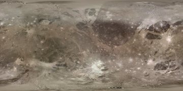
A map of Ganymede
This map of Ganymede was created back in 2000 from more than 100 (!) images from the Voyager and Galileo spacecraft. Most of these had a resolution of roughly 0.7-3.5/pixel km except for two relatively small areas where the resolution is considerably lower. In addition I used lower resolution images (roughly 10-30 km/pixel) to colorize the map. I am also grateful to Constantine Thomas for a mosaic of the Osiris area that I integrated into the map and for valuable ideas and tips.
The map is of a quality similar to my map of Callisto (possibly very slightly lower). This map is primarily intended for 3D rendering. I have managed to fill several gaps and fuzzy areas that are present in a USGS map of Ganymede that I have, e.g. the one roughly WSW of the creater Osiris. I did this using a few Voyager images apparently not used in creating the USGS map. I don't know why these images were not used in the USGS map; a possible reason might be concerns about positional accuracy or the color filters used. The only gaps that remain are small areas near the poles. I have removed these by "cloning" data from adjacent areas. There is more detailed/technical information about this map and how it was created on another page.
Click the map below to get the full size map (1800x900 pixel 353 KB JPG). The map is in simple cylindrical projection with latitudes running with a uniform interval from -90 (bottom) to 90 (top) and longitude 0 at the left edge of the map. It should be rendered by projecting it onto a sphere of 2634 km radius or some equivalent unit.
A "mask map" is also available below. It indicates the quality of the above map in different areas within it. The colors have the following meaning:
Black: These areas contain actual data and should be very accurate.
Dark gray: Low resolution source images and/or features fixed by hand
using global images as a guide. Should look accurate in global renderings but fuzzy and/or
inaccurate in closeups. This also includes areas with somewhat distorted (but real)
features because of inaccuracies in the viewing geometry information. Also includes data
which may be accurate but which I strongly suspect is not. In particular, the parts of
these areas farthest from the poles are probably (almost) OK but the areas closer to the
poles are more likely to be "bad".
Light gray: Fictional/cloned data because no images showing these areas
are available. Also areas where e.g. craters are so highly distorted that it is obvious
that it is pretty much useless.
Click the map below to download the full-size mask.