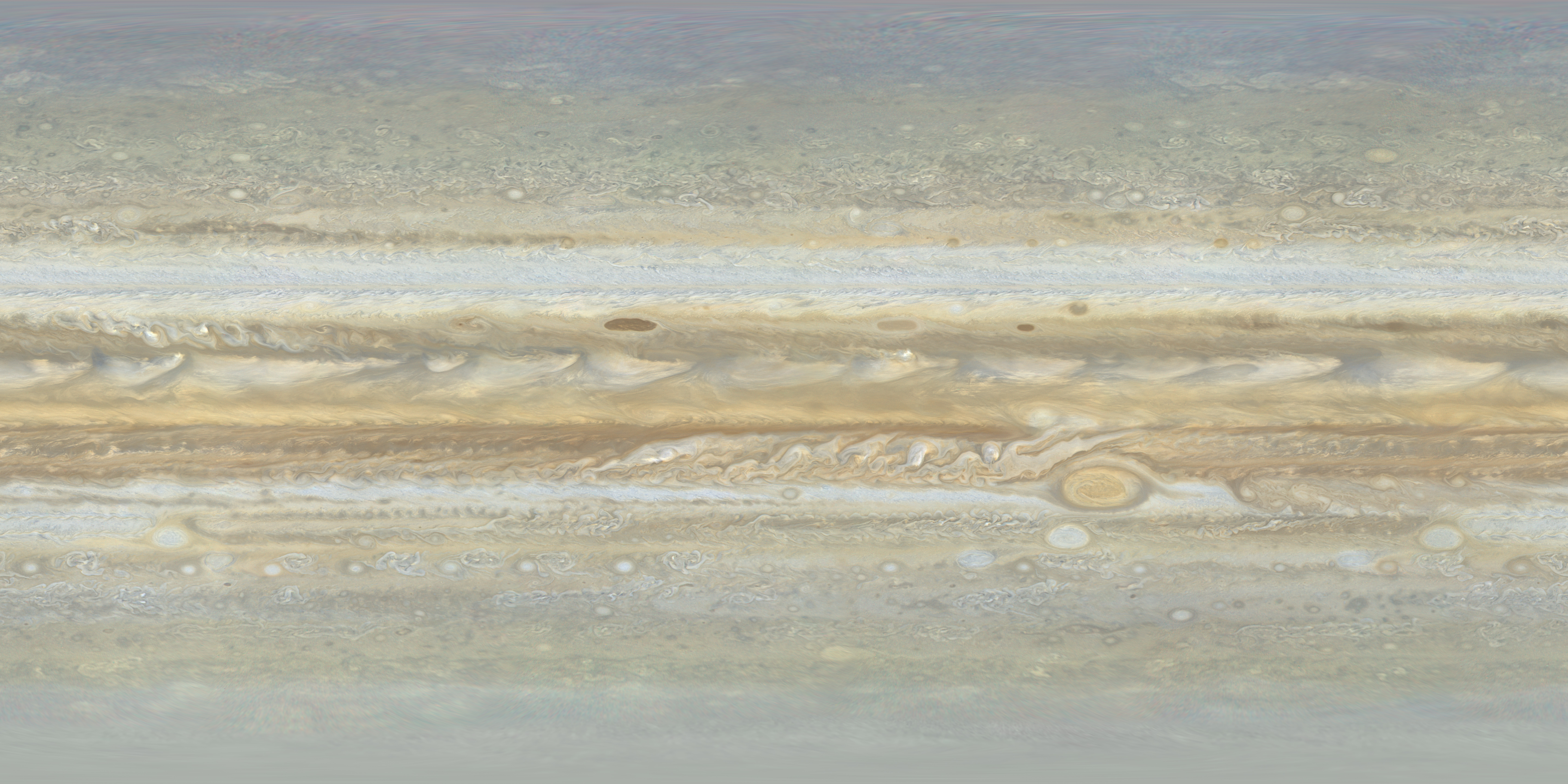
A Voyager 2 map of Jupiter
This is one of two Voyager 2 maps of Jupiter available at this website. Compared to the other Voyager 2 map, this one is far newer (2025 vs. 2002) and of higher quality. It is positionally more accurate and the color is better. The color is better thanks to improved processing and because here orange, green and violet images were available whereas the source data for the 2002 map consists of orange and violet only since no green images were obtained. The resolution of this new map is a bit worse though (~15% lower) than the resolution of the old map since the images were obtained farther from Jupiter (~10.1 million km from Jupiter vs. ~8.6 in the old map).
This map of Jupiter was created from 135 images obtained by the Voyager 2 spacecraft on June 28, 1979 from a distance of about 10 million km. Latitudes are planetographic with a uniform interval from -90 (bottom) to 90 (top). Longitudes are in System III with longitude 0 at the left/right edges of the map and longitude 180 at the center. The map should be rendered by projecting it onto an ellipsoid with an equatorial radius of 71516 km and a polar radius of 66871 km or some equivalent units. Below is more detailed information about the map.
Click the image below to download the full size map (4.3 MB 5760x2880 pixel JPG). Polar maps are also available at the bottom of this page.
Source data and processing
On June 28, 1979 between 12:04:47 and 20:42:23 UTC, Voyager 2 obtained 135 images of
Jupiter with its narrow angle camera, 45 through the orange filter, 45 through the green filter and 45 through the
violet filter. This imaging sequence consists of 3x3 mosaics of orange/green/violet images,
resulting in a total of five 3x3 mosaics. These mosaics were assembled into the map above.
Due to overlap, the true number of images in the map is probably a bit lower than 135.
The size of the map is 5760x2880 pixels which oversamples the data a bit. I did this to
compensate against the slight loss of resolution caused by the resampling/reprojection of
the images.
The source data used consists of calibrated images from the Ring-Moon Systems Node of NASA's Planetary Data System (PDS). I used the calibrated images and not the geometrically corrected (and calibrated) images. The reason is that even though various artifacts and noise have been removed from both the calibrated images and the geometrically corrected images there are still some residual artifacts (in particular very subtle horizontal lines) that are easier to remove from images that have not been geometrically corrected. I removed these artifacts using a flat field image I created from a specially processed average of many calibrated images. I then used control point information available with the geometrically corrected images to warp the resulting images and create my own geometrically corrected images. These images were then reprojected to simple cylindrical projection. They were also illumination-adjusted on the fly. This was done using a Minnaert function where the Minnaert k parameter varies as a function of both latitude and filter (orange/green/violet). Varying the Minnaert parameter as a function of latitude instead of using the same parameter value everywhere greatly reduces the amount of manual work required to remove residual seams between adjacent images. In particular, the photometric properties of the polar regions differ significantly from areas closer to the equator.
The viewing geometry was taken from the Voyager 2 SPICE kernels. However, the camera pointing information was very inaccurate (typically off by ~100 pixels) and had to be corrected. For images where Jupiter's limb is visible I used limb fits to correct the pointing. For other images I used features visible in adjacent, overlapping images where the pointing had already been corrected. Despite some cloud motions this turned out to be slightly more accurate than limb fits from wide angle images obtained at exactly the same time as the narrow angle images. Following this I had orange, green and violet map-projected images. These images were then used to create an orange-green-violet map-projected image. The map-projected images were then assembled into five 3x3 mosaics. These five mosaics were then mosaicked into the map above.
Missing data and gaps
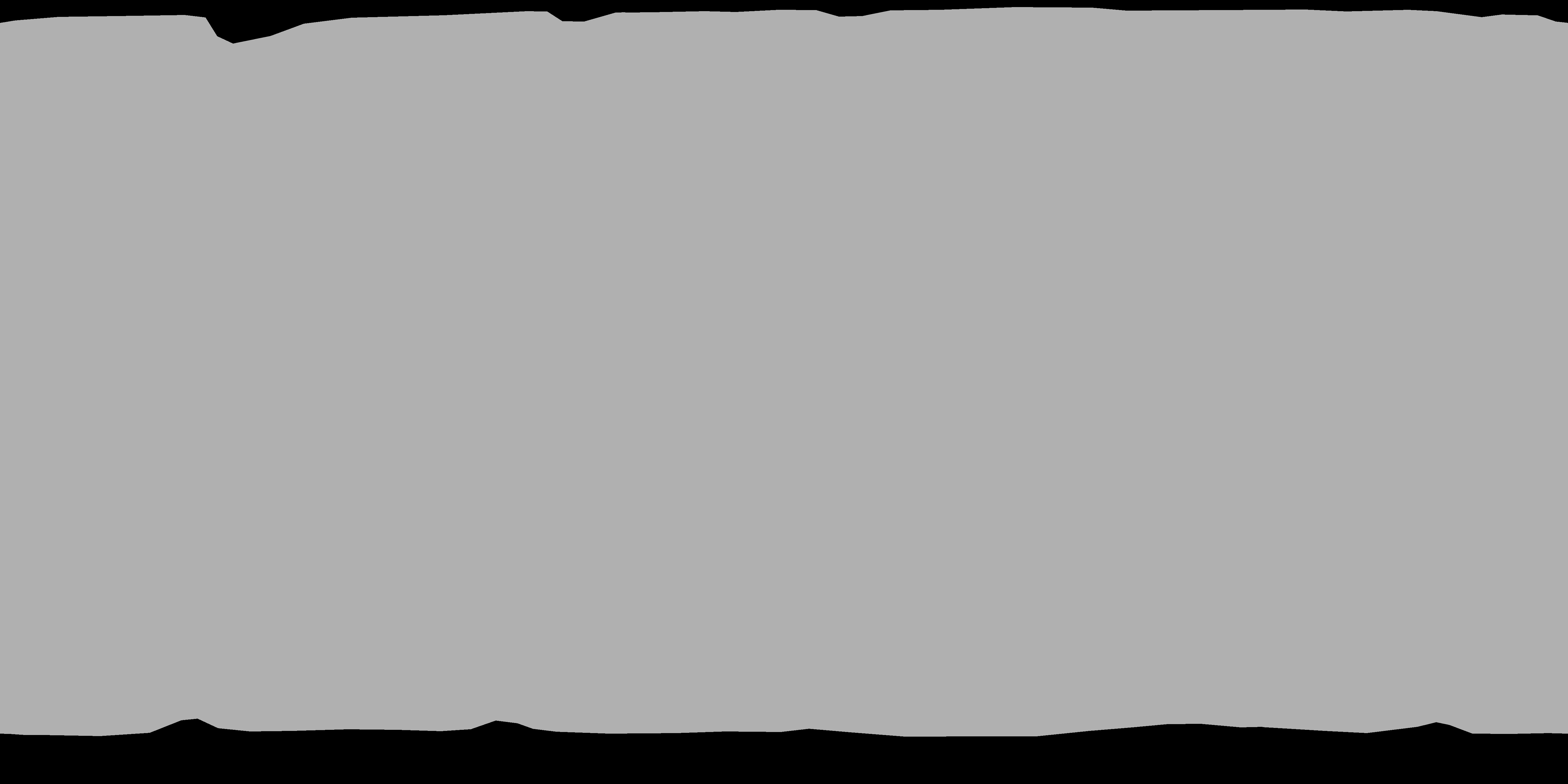
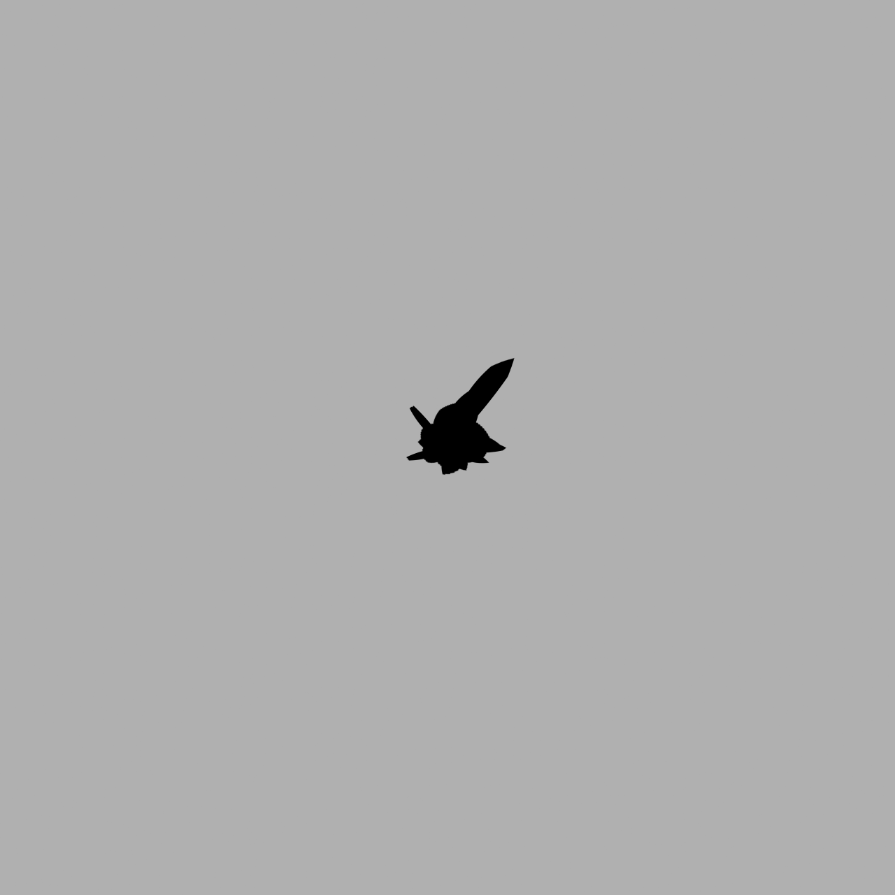
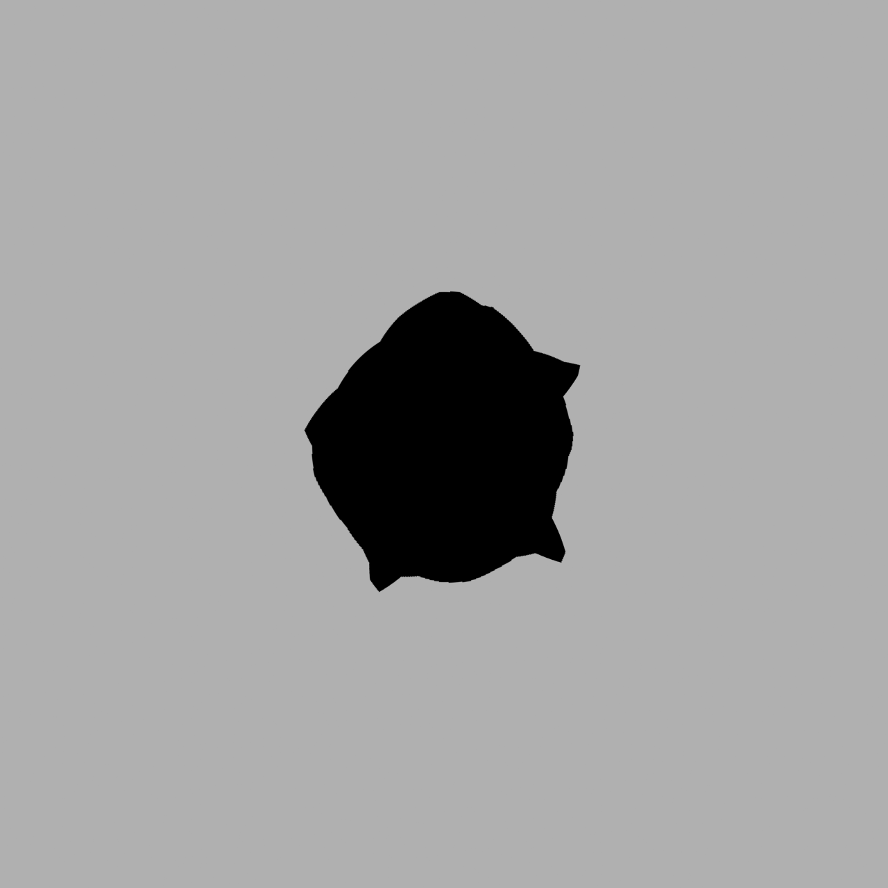
Once I had finished mosacking everything together, small gaps remained near the poles, especially the south pole. For
the south polar region the reason is obvious (Voyager 2 was about 6.7� north of Jupiter's
equatorial plane) but the reason was also extremely dim lighting near the poles, highly
oblique viewing geometry and inaccurate camera pointing. I filled these small gaps using
smooth and featureless dummy data. The dummy data is indicated with black in the mask map
below. The black area also indicates real data that is useless (dim lighting, extremely
oblique geometry etc.) as well as small areas that I modified manually to remove seams
between adjacent images/mosaics.
Color correction
Following the processing steps described above I had a seamless orange-green-violet global map with no gaps.
However, the color was inaccurate because orange imaging data was used instead of red and violet was used instead of blue.
To correct this and get something closer to a true red-green-blue image I used Jupiter's global visible light spectrum
and the orange, green and violet values to estimate Jupiter's spectrum for each pixel in the map
using the effective wavelength of Voyager 2's orange, green and violet filters. RGB values were then
computed from the estimated spectrum at each pixel. This resulted in a map where the color looked much more realistic than
the color of the original orange-green-violet map. I decided to make one final and rather arbitrary
correction to the color though. In the largest whitish areas in the map I found it a bit strange that the
green values were slightly higher than both the red and blue values. Because of this I decided to multiply
blue by 1.024.
Accuracy
The positional accuracy of the map is difficult to estimate very accurately since I don't
know exacly how good the limb fits are. However, two overlapping images corrected using
two different limb fits can be compared. The typical difference in these cases is 3-4
pixels in latitude/longitude near the equator. 4 pixels corresponds to an error of 0.25
degrees in latitude/longitude. The error might be bigger (~0.5 degrees?) at some
locations. Some of this difference is probably caused by cloud movements. Closer to the
poles the error increases but it is not large (the biggest difference I saw was 1-2
degrees at very high latitudes).
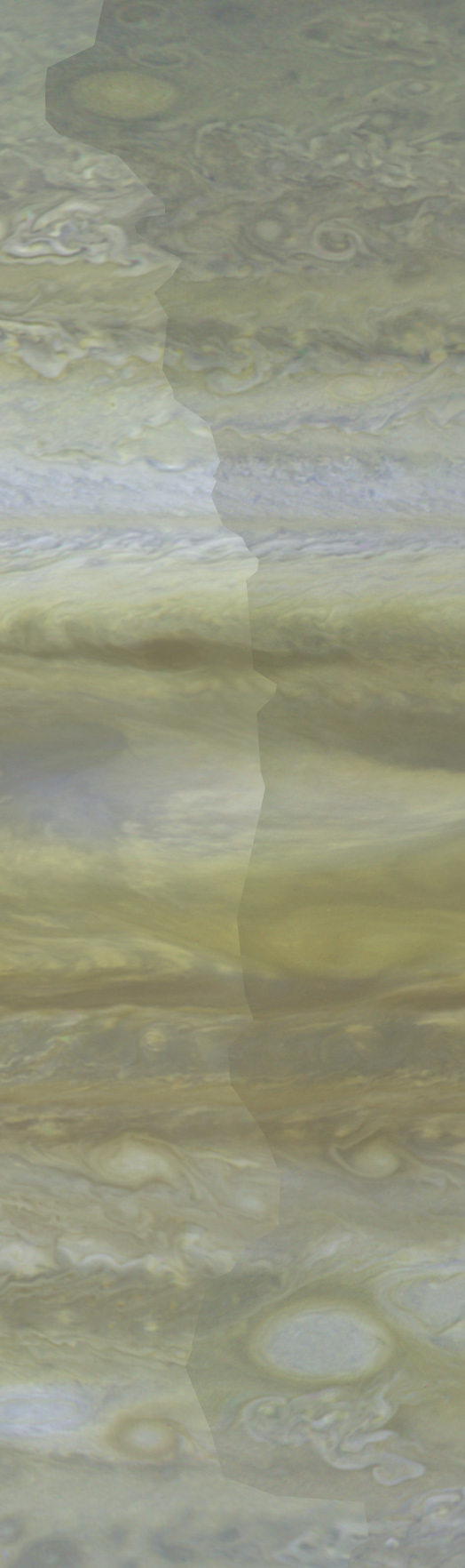
Needless to say, the error is larger where images from the start and end of the imaging sequence overlap. These images were obtained almost 9 hours apart. This resulted in an obvious seam near longitude 35 that I removed manually. I first carefully modified the seam's exact edges in the overlap area to include uniform areas where possible and not any major high contrast features like prominent spots. A sample of the seam before I removed it manually can be seen below (click the image for the full size version). The right overlapping image has been darkened to make the seam more obvious but as can be seen, even without manual modifications the seam is rather subtle at most locations. The color of this image is different from the color of the final map because here the color had not yet been corrected.
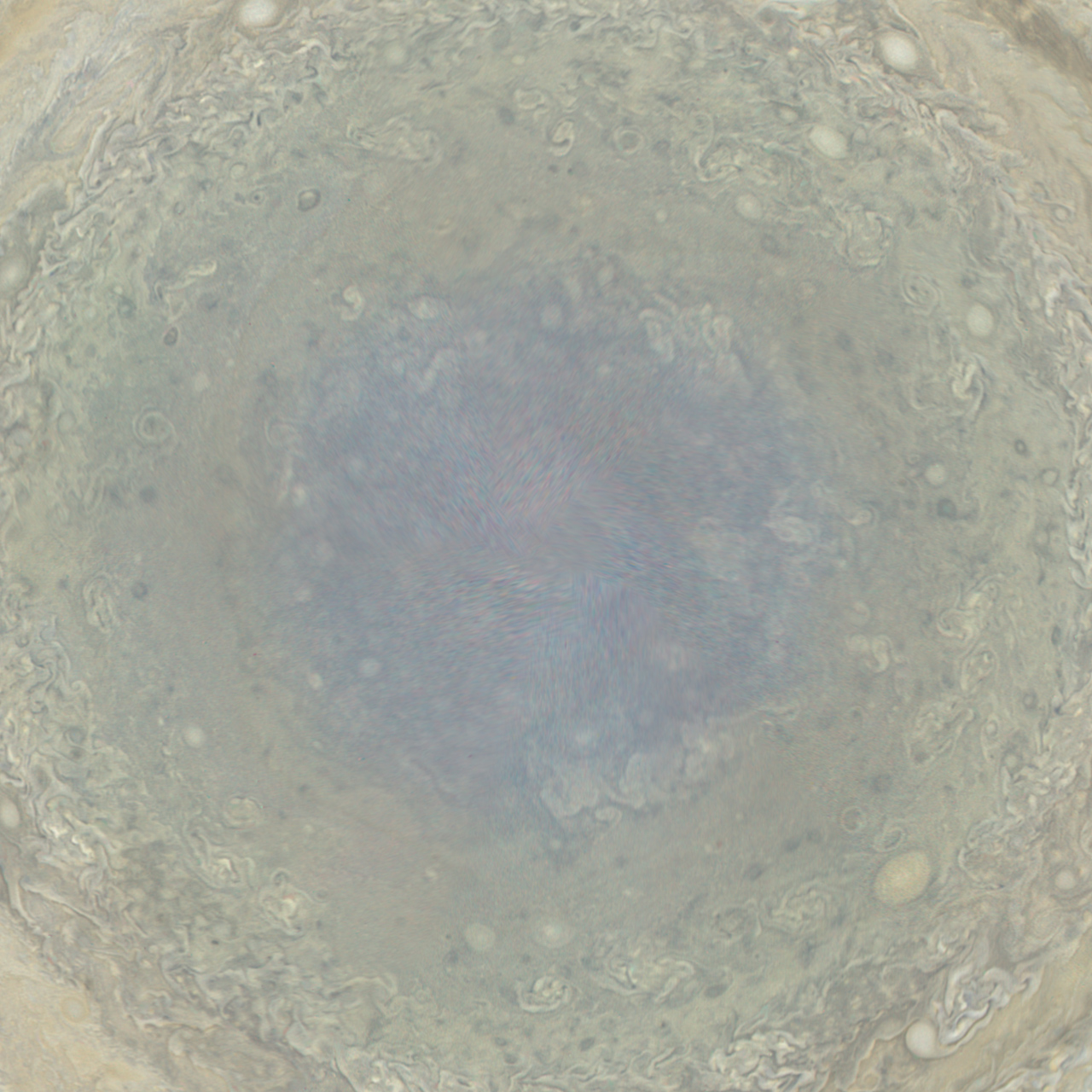
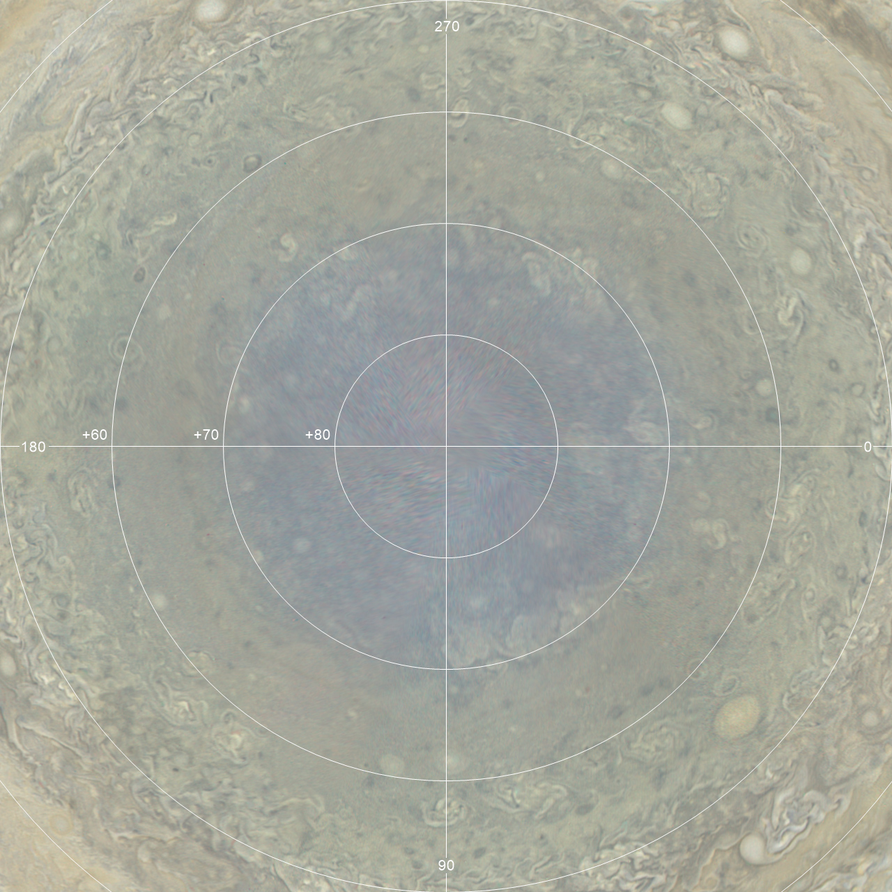
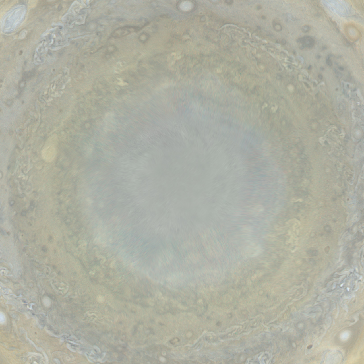
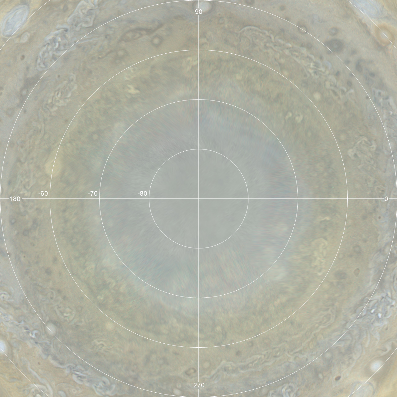
Polar maps
Below are polar maps showing the same data as the above maps. They show the
region from latitude 50 degrees to the pole.
| N polar region without grid | N polar region with lat/lon grid | N polar region bad data mask |
 |
 |
 |
| S polar region without grid | S polar region with lat/lon grid | S polar region bad data mask |
 |
 |
 |